How to Visualize Your Music Data
Leveraging Spotify Wrapped's momentum in 2022, I created a beginner-friendly guide to visualizing personal music data in Tableau, a data visualization software. This filled the gap for true-beginner level projects and piqued interest with its cultural relevance, remaining the most visited blog for 4 consecutive months.
What is Iron Viz: Student Edition?
An informative piece describing the Iron Viz: Student Edition competition's origins, entry requirements, judging criteria, and celebrating past winners.
27 Data Visualizations to Gain Insight into Global Literacy
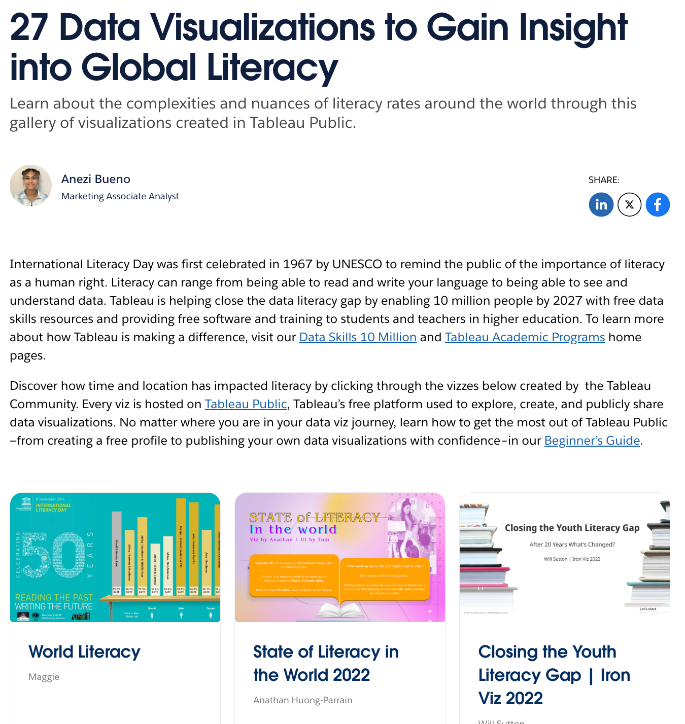
Shining a spotlight on the complexities and nuances of global literacy rates, I curated a data visualization gallery addressing topics from female literacy to youth literacy rates.